
White Label has traditionally occupied a secondary position within the Sensi Seeds portfolio, resulting in a long-overdue refresh of its visual identity. I was tasked with modernising its look and feel, with a focus on packaging applied to existing blister seed packs. I developed two design directions. The first combines bold typography with vibrant colour, deliberately contrasting the “White Label” name. A central round shape highlights the blister area while echoing the form of the seeds. The second direction explores a retro-inspired aesthetic, using an abstract gradient pattern, clean sans-serif typography, and a colour palette referencing the American flag—an intentional nod to White Label’s increasing focus on strains with US genetics.

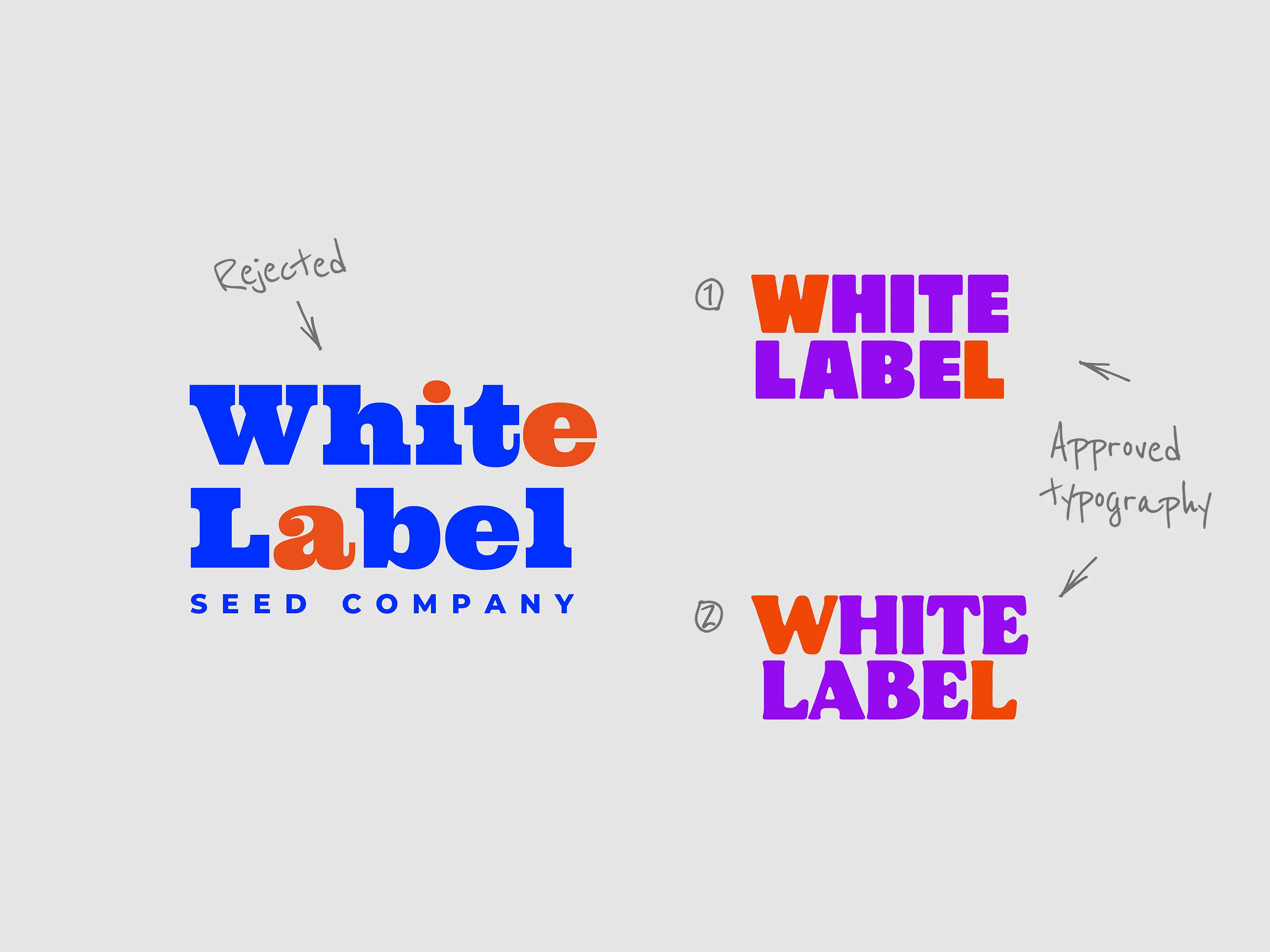
The first design direction was selected, with several refinements following stakeholder feedback. The rounded shape overlaying the seed blister and the use of a vibrant colour palette were well received. However, stakeholders requested additional iterations exploring different typefaces. They specified that the lettering should appear in uppercase and wanted to emphasisize the initials “W” and “L,” representing White Label, through the use of contrasting colour. As the word “label” contains two instances of the letter “L,” I chose to highlight the second “L.” This decision intentionally avoids symmetry, adding a subtle point of visual interest to the composition.Based on this direction, two font families were selected for further mockup development.
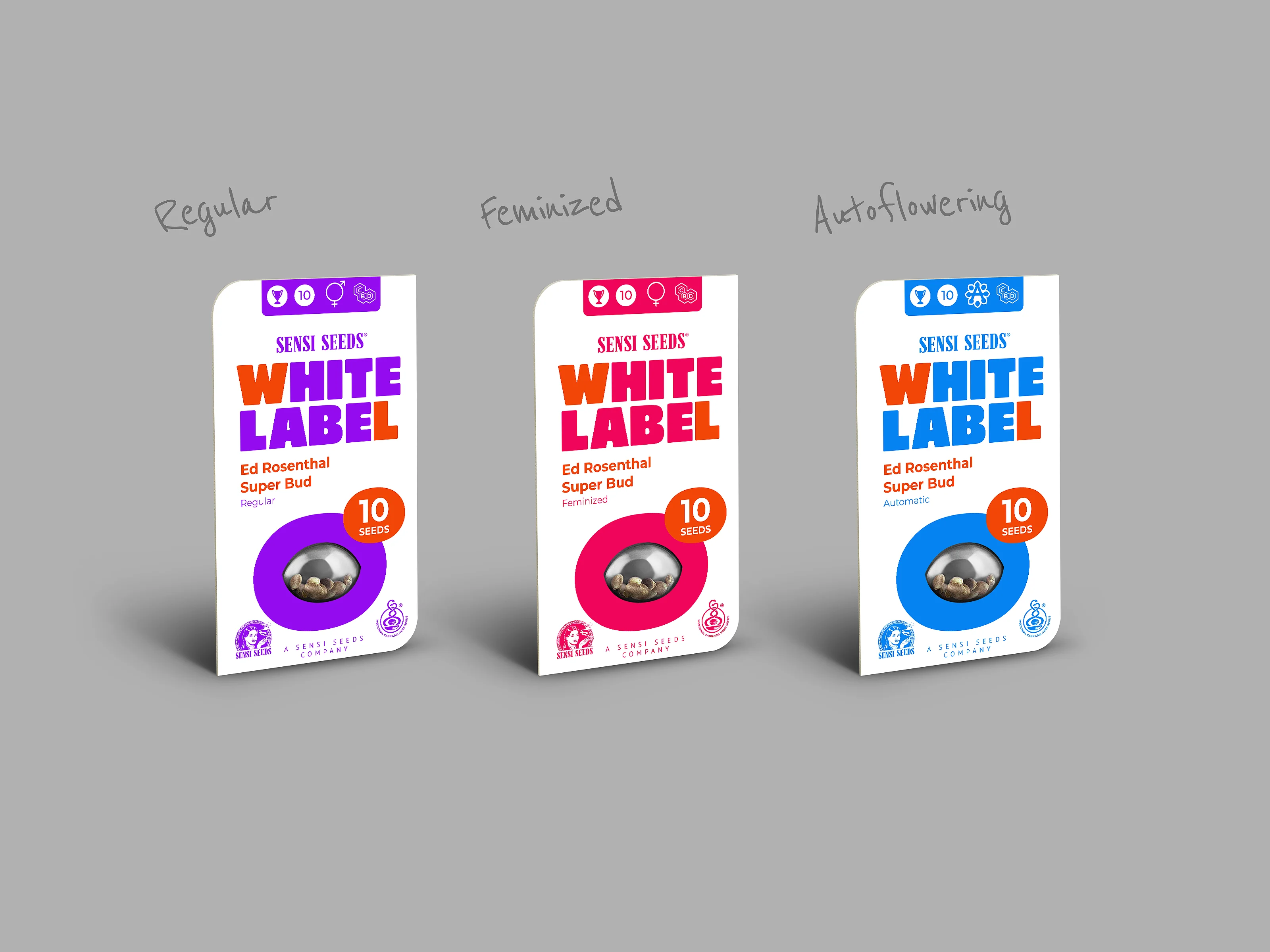
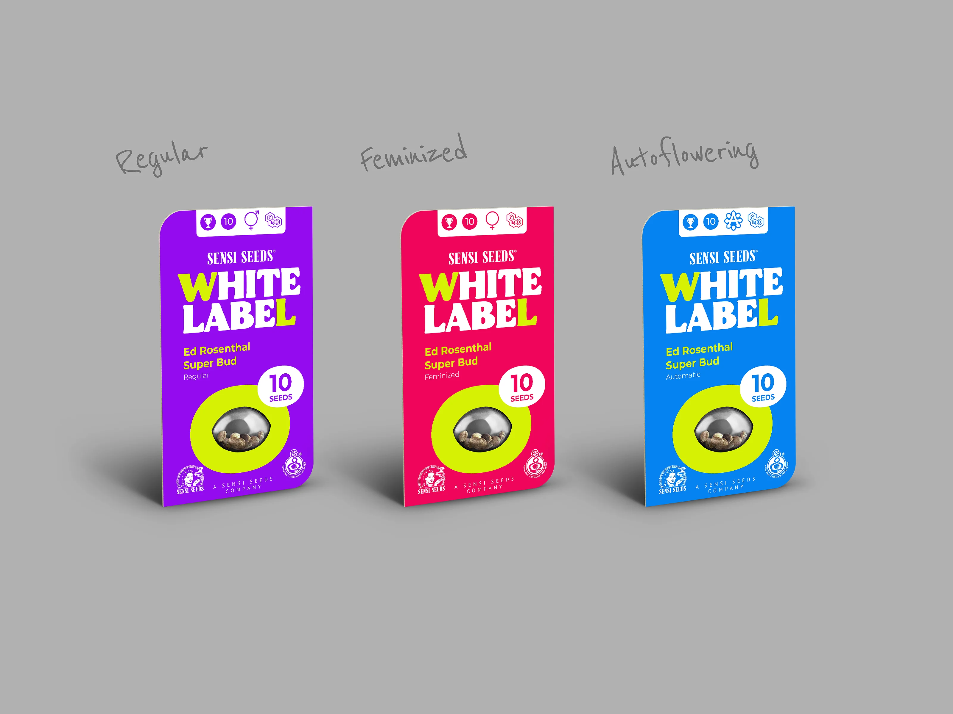
Building on the selected typefaces, I developed a series of colour variations for each direction. These included both vibrant graphic elements on white packaging, as well as coloured packaging paired with more restrained graphics. The seeds are available in three variants—feminized, autoflowering, and regular—which is why each colourway was applied across three corresponding packaging types. To ensure consistency and adaptability, I used the longest strain name in the catalogue as a reference point, allowing the design to accommodate all naming variations without compromising layout or readability.
< Back to projects